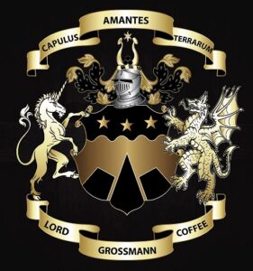
Regal Luxury with a Military Twist: The Lord Grossmann Coffee Logo
- Home
- portfolio
- Graphic Design
- Logo
- Regal Luxury with a Military Twist: The Lord Grossmann Coffee Logo
 The Lord Grossmann Coffee logo is a powerful and striking design that embodies the brand’s commitment to quality and excellence. The logo features a golden and black color scheme, which exudes a sense of luxury and sophistication, and is set against a bold, military style.
The brand name, “Lord Grossmann Coffee,” is written in a bold and elegant font in gold, perfectly positioned within the center of the logo. The lettering is stylish and modern, with clean lines and perfect spacing, creating a harmonious and visually pleasing composition.
The coffee cup icon is designed to resemble a royal crown, symbolizing the brand’s commitment to quality and excellence. The coffee cup is adorned with a military-style emblem, adding to the logo’s sense of strength and power.
The overall color scheme of the logo is black and gold, which exudes a sense of luxury and sophistication. The use of gold adds a touch of elegance and luxury to the design, while the black background creates a sense of contrast and balance.
The Lord Grossmann Coffee logo is designed to be easily recognizable and memorable, with its bold imagery and elegant typography. It effectively conveys the brand’s values of excellence, strength, and luxury, making it a powerful and effective visual representation of the company.
Overall, the Lord Grossmann Coffee logo is a powerful and striking design that effectively communicates the brand’s commitment to quality and excellence. It is a bold and distinctive design that is sure to capture the attention of customers and effectively promote the brand.
